ONS hackday Census data unplugged
Remote participants at the hackday
We’d planned a hack day at the Office for National Statistics for our work on Census 2021 towards the end of May. But the arrival of Covid-19 meant we had to pivot to making the event virtual.
The objective was to allow ONS data scientists and analysts the opportunity to road test an innovation that will happen when anonymised, high level Census 2021 data are released. It’s called flexible table builder and is powered by our software Cantabular.
Cantabular applies privacy protections as a query is processed in order to produce safe tables of aggregated data. Queries are facilitated by an API that has two design objectives; security and speed.
What is a flexible table builder?
We’ve been working with the ONS to modernise the way Census data are protected and disseminated. At the heart of the census is the principle of keeping information safe, confidential, secure and private — no one can find out individual’s details for 100 years.
However, aggregated census data are essential to inform decisions nationally and locally on vital services and issues like diversity. And the ONS has made a commitment to provide more timely information and analysis.
At the start of the hackday, our sponsor introduced the concept and how it had the potential to dramatically change how Census data can be made available
Before: For Census 2011, there was a 16 month lag between the final day of collection and the first output table appearing on the ONS website. It took up to 4 years to produce all the output tables. It was a time consuming process that required significant human intervention and expert decision making.
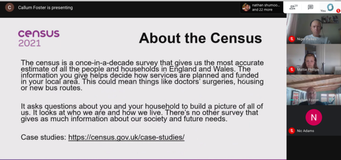
Figure 1: Some background on the Census
After: the ONS wants to collapse the time frame, producing first results within 12 months of data collection, and make as many census statistics as possible available soon after that first date of publication; aiming to do so within a year. This will increase the contribution census data make to the economy and provide much higher value to ONS customers.
Modern tools and a large synthetic dataset
We’ve been working on a Python API client that makes it easy for data scientists to query the data as part of their applications and visualizations. We created extra documentation and ran a short tutorial at the start of the event to help the analysts get started and see some useful code snippets.
We spun up a server instance running a hosted Jupyter notebook to support anyone who was unable to install the Python package because of security restrictions which worked really well.
The hackday participants were working with a 57 million row artificial dataset that mimicked the 2011 census and to give a real sense for the lightning speed with which a query can return results.
Despite the challenges of working remotely, the assembled company managed to organise into six groups around an impressive variety of ideas and almost all managed to show a working prototype within a few hours.
The judges said:
“The teams worked well together. The fact that it was a remote event did not detract from the quality of work produced; we were impressed with the range of ideas; the speed with which they were realised as well as the potential for these to be developed further.”
Winner: Map areas where my query is too disclosive
The winning team approached an issue that is likely to present itself when disclosure control is applied to data. If generated data for an area are too disclosive, the flexible table builder suppresses the output. It may be possible to get more aggregated data by performing the same query at a higher geographic area (e.g. Middle Super Output Area (MSOA instead of LA) or by using variables with fewer categories (e.g. ages grouped into 5 year bands instead of individual years). The program highlights these missing areas using a choropleth map. The team produced a working proof of concept. It demonstrated great collaboration between the data science campus and the census outputs team.
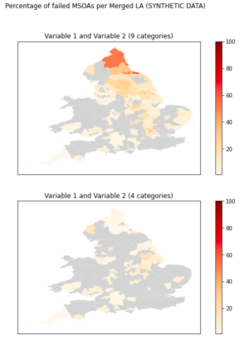
Figure 2: Choropleth map highlighting missing areas where a query is too disclosive
Where should I move to?
The initial idea was to create a tool to help someone find places they might like to live based on factors that were important to them such as good health or level of education.
A user would select factors that were important to them, and the tool would perform queries using the API to find areas that met their desired criteria.
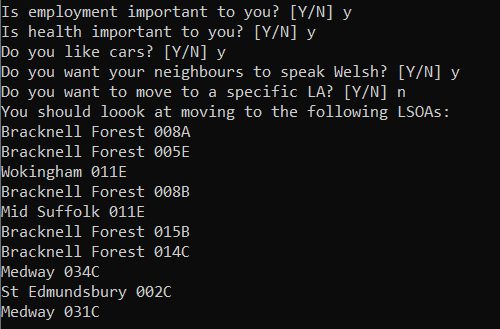
Figure 3: Tool to help people find places to live based on factors important to them
Where is similar to where I live today?
The purpose of this tool was to identify similar areas based on a set of chosen variables. The tool used a similarity matrix l to find the most similar areas to a specified Local Authority (LA). To improve this program, the team suggests developing a UI and to generate a map on output, highlighting similar LAs. If an LA had a problem, such as low educational attainment, they could use this tool to find other LAs with a similar population but high educational attainment. Planners could then engage with those other LAs to identify any approaches that might benefit their own area.
Mapping postcodes to census geographies
This idea looked at linking Census data to a particular postcode. The tool would map the postcode to areas in the census geographic hierarchy e.g. What Lower Super Output Area includes my postcode?’ A UI was developed that enabled the user to input a postcode into a search box at the top of a page, then when the postcode is submitted, a list of anonymised information would be output. This approach could be applied to alternative geographies such as school district.
The commonalities quiz
This team worked on an idea to create a fun game using census data. A commonalities quiz was produced and presented in an easy-to-use UI. Random shuffling was used to make the quiz different each time it was run. The questions are based around identifying areas that are similar according to different characteristics. The project showed that a dataset can be used to return random questions. A quiz like this could be tailored for different audiences e.g. school children.
Figure 4: 2021 Fake Census Data Quiz
Identifying Covid-19 risk factors
This idea was inspired by a recent ONS publication around ethnicity and the risk of being a victim of Covid-19. The team looked for a link between various variables (such as commuting distance and mode of transport) and Covid-19 deaths. Their hypothesis was that public transport was a contributing factor in the spread of Covid-19 — the longer spent on transport, the higher risk of being infected. The team produced a program that estimated the average time a commuter spent on public transport using a number of basic assumptions. They feel confident that the queries could be combined with more accurate commuter data to establish whether commute time is a Covid-19 risk factor. A similar approach could be applied to other variables.
A virtual hack day requires lots of planning!
We’d originally planned for an onsite face to face hack day — for which we had experience. Covid lockdown put that idea on ice. We prepared for weeks — we tested and retested the systems. We had a group of users who downloaded the Python client and made sure they were able to access the hosted synthetic dataset. We also had fantastic support to mobilise a bunch of analysts from the data science campus, census outputs and digital publishing including a data analyst in Beirut. We used a designated Slack workspace with channels for announcements, team communications and tech support. We used Google Meet for presentations and for the API tutorial.
What happens next?
We’re hoping that some of the ideas presented on the day will be considered for further development and to inspire analysts inside the ONS. We’re developing a Go client and we’re responding to user feedback on how the API worked for the participants.
We’d like to thank everyone at the ONS who participated and who helped make the event successful.

Figure 5: Hackday sticker